Symphony
Context
Background
Symphony is a secure team collaboration platform for professional and enterprise users, with a current focus on financial services. It runs on web, desktop, and mobile.
Goal
Deliver the first version of Symphony, focusing on the secure messaging aspect of the product.
Role
I joined Symphony as the first UX designer to help execute the vision for the initial release of the product. We started out with a team of engineers, a product manager, a visual designer and myself. Once the design team had expanded, I became the lead designer to oversee the core product and to ensure coherence between the web and mobile platforms.
Process
Define Personas and Experience Goals
Symphony started out as a marriage between an encrypted messaging app called Perzo, and an internal tool at Goldman Sachs. It already had a small active user base in the financial services by the time we set out to re-design Symphony. As a result, we already had a large collection of user feedback to help us identify and prioritize the pain points we needed to address.
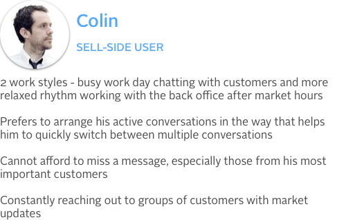
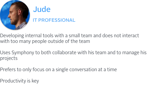
Proto Personas
Due to resource constraint, I started by interviewing subject matter experts at Symphony to create a few proto personas.

Establishing Experience Goals
Together with a PM, we identified, based on user feedback, the key areas we needed to improve. We mapped these areas to the personas to arrive at the improvements that are applicable to everyone. I then expressed these improvements in terms of how they help to meet the needs of our users. It is essentially a set of metrics for how well we are solving our users' problems.

An initial set of user experience goals.

An example of how to meet one of the experience goals.
Design Iterations
I focused on improving a few key areas based on product priorities determined by the PM. For each of these areas, I completed multiple iterations of the design and facilitated usability sessions, most of which were completed on-site with the end users using a prototype. We took an incremental approach to introducing product changes because of our existing users.
Conversations
Symphony supports 1:1 IM, multi-party IM as well as chat rooms. Our users were having trouble discerning between these different types. While we wanted to simplify the chat experience, we recognized the need for drawing a line between an IM and a chat room due to compliance implications for the financial services. I started out by defining the life cycle of a conversation. Following that, I looked at the experiences that should be unified across the different chat types, and those that may be unique to each type.
Diagram showing the life cycle of a conversation.
Navigation
Navigation was another area that needed some attention because users were having trouble locating items in the navigation. we wanted to improve to raso that the users could more easily manage and navigate between their tasks. I tackled the problem by first identifying the types of entities that populated the navigation. I then explored ways to represent these entities for easy identification and scannability. Finally, I made sure that the navigation works well in a responsive framework.
The main sections of the navigation.
Making the navigation responsive by defining how it can be resized based on the width of the window.
First Time User Experience
Finally, another area that went through a lot of iterations was the first time user experience. There were two parts to this: the registration/sign-up flow, and the tutorial highlighting basic features. For part one, I mapped out the different paths a user might take, and worked closely with a mobile designer to ensure coherent experiences across platforms.
Diagram showing the different paths a user may take from registration to using Symphony for the first time. The main steps are 1) sign up, 2) email verification, 3) 2 factor authentication, and 4) logging into the app.
For the remaining of the experience, I brainstormed with my teammates on the key Symphony features we wanted to highlight for the different personas and entry points to Symphony. I then created various user flows based on our discussion, got feedback from the team, and iterated again. The version of the tour that resonated the most with the team was one based on interactions with a bot. Throughout the entire process, we built 5 prototypes, and presented to an audience that consisted of our CEO, marketing team members, and a few PMs. We also ran 2 rounds of in-person user testing to help refine our design.
Sketching to figure out the top priorities for a new user.
Wireframing the user flow.
beta release
Due to resource constraint, the beta release addressed a subset of the top issues we set out to tackle. A lot of the improvements were centered around starting new conversations and navigating between them. By simplifying the information in the navigation, providing multiple display density options, and supporting customized layout of workspace, we made it easier for the users to see more conversations and navigating between them. As for first time experience, we implemented a much simpler version of the tour that presented the features in a more static way without a bot.

